

Beschrijving

Block Editor: Reverse Columns on Mobile
Beschrijving
This plugin adds a “Reverse on Mobile” option to the Columns, Row, Stack and Media & Text blocks in the WordPress Gutenberg block editor. This option allows you to reorder columns in mobile view for better presentation.
Schermafbeeldingen
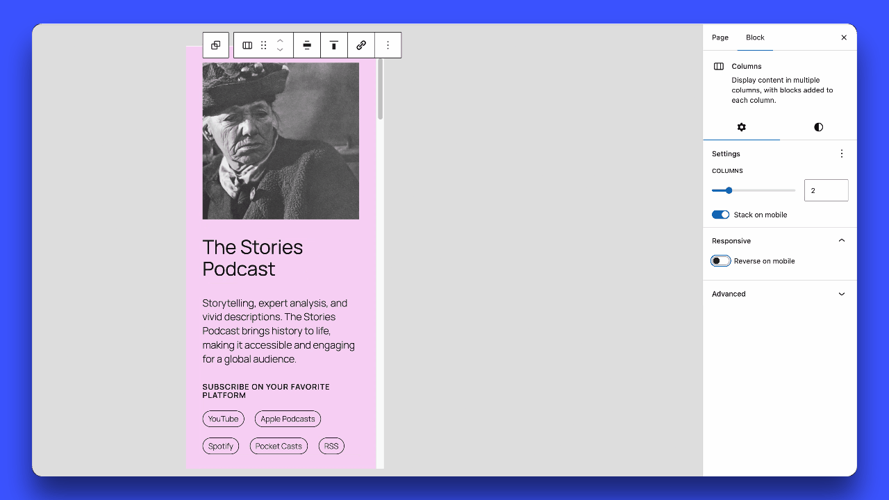
Enabling and disabling the “Reverse on Mobile” option in the block settings panel.

Installatie
- Download the plugin.
- Unzip the downloaded file.
- Upload the
block-editor-columns-reversefolder to the/wp-content/plugins/directory. - Activate the plugin through the ‘Plugins’ menu in WordPress.
FAQ
Which blocks are supported?
The
core/columns,core/group(flex layouts), andcore/media-textblocks are supported.How do I enable the “Reverse on Mobile” option?
In the block editor, select a Columns, Row, Stack or Media & Text block, then go to the block settings in the sidebar. You will see an option to “Reverse on Mobile”.
Note: For Row blocks, you must enable “Allow to wrap to multiple lines” in the Layout settings for the reverse option to appear.
What is the breakpoint for the mobile view?
The mobile view breakpoint is set at less than 782px, matching the one used for the
core/columnsblock. When the screen width is 781px or smaller, columns will reverse their order if the “Reverse on Mobile” option is enabled.For the
core/media-textblock, the default breakpoint is 600px or below.
Beoordelingen
Bijdragers & ontwikkelaars
“Block Editor: Reverse Columns on Mobile” is open source software. De volgende personen hebben bijgedragen aan deze plugin.
Bijdragers
Vertaal “Block Editor: Reverse Columns on Mobile” in je eigen taal.
Interesse in ontwikkeling?
Bekijk de code, haal de SVN repository op, of abonneer je op het ontwikkellog via RSS.
Changelog
1.0.10
- Fixed: Stack blocks now correctly reverse only on mobile, desktop layout remains unaffected.
1.0.9
- Improved performance: CSS is now loaded only on pages using the reverse feature.
- Support for 6.9.X.
1.0.8
- Fixed: Group Row blocks with wrap disabled (nowrap) no longer display the “Reverse on mobile” option in settings.
- Fixed: Group Row blocks with wrap enabled now use
wrap-reverseto correctly reverse elements when they wrap to multiple lines. - Fixed: Horizontal alignment (left/right/center/space-between) is now preserved when Row blocks wrap.
1.0.7
- Support for 6.8.X.
1.0.6
- Refactor responsive styles.
- Add support for
core/media-textbreakpoint (<= 600px).
1.0.5
- Removed the ‘Reverse on mobile’ option in
core/groupwhen the layout is undefined.
1.0.4
- Fix: Resolved the issue where ‘Reverse on mobile’ always stacked elements on mobile, even when ‘Stack on mobile’ was turned off.
- Separated CSS for front-end and editor.
1.0.3
- Added support for
core/media-textblock. - Removed the option when the group block is in the default constrained layout.
1.0.2
- Improvements to avoid potential conflicts with third-party code.
1.0.1
- Support for 6.7.X.
- Update text domain for i18n consistency.
1.0.0
- Initial release of the plugin.

